Stay In This World
The stories, the culture, the conversations. Every week.
No spam. No third parties. Just Unruly.
At the 2026 World Cup, the most interesting design conversation is happening on the continent with the most to say.
A football kit is not sportswear. Not really. It is, at its most functional, a way of distinguishing one group of eleven people from another. But that is the floor of what it does, not the ceiling. At its most intentional, a national football kit is one of the most compressed cultural documents in existence: a single garment that has to carry a nation's colours, its history, its symbols, its sense of itself, and its desire to be seen in a particular way, all at once, on the largest sporting stage in the world.The stakes of that compression are different depending on where the shirt comes from. For nations with long and dominant football histories, the kit is largely about continuity. Germany's diamond pattern nodding to 2014. Argentina's three shades of blue uniting its three World Cup victories. Italy's Azzurra written in gold on the collar. These are love letters to an existing legend, letters that can afford to be self-referential because the legend is already established and globally recognised.For African nations, the challenge is different, and the opportunity is larger. The story is not yet complete. The visual language is not yet fixed in the global imagination. And the continent's actual visual and cultural richness, its textiles, its architecture, its art movements, its urban energy, its linguistic diversity, its ancient symbolism, remains almost entirely untapped as a source for how these nations represent themselves on the world stage. The 2026 World Cup kits suggest that something is beginning to change.
Before we get to the shirts themselves, it is worth asking what exactly is being asked of them.
A national football kit has to do several things simultaneously. It has to be visually distinctive at speed and distance, legible on a screen in a living room in Lagos or Dakar or Marrakech. It has to perform under elite athletic conditions, which places real constraints on fabric weight, cut, and structure. It has to be commercially attractive enough to sell millions of units to fans who will wear it not on a pitch but on streets, in markets, at celebrations. And it has to represent something true and specific about the nation it belongs to, or at least something that feels true and specific to the people who will wear it.
That last requirement is where the design conversation gets genuinely complicated. The brands doing this work, Nike, Adidas, and Puma dominate the 2026 tournament, dressing 35 of the 48 qualified teams between them, are not African. They are not staffed primarily by people with intimate knowledge of Moroccan tilework, or the visual language of Dakar's street culture, or the specific gravity of South Africa's linguistic history. They are global corporations with design studios in Portland and Herzogenaurach, working with research teams and federation liaisons to produce something that will feel authentic to audiences whose culture they are interpreting from the outside.
When this process works, the results are genuinely moving. When it fails, you get a shirt that borrows the surface of a culture without understanding its depth, a generic pattern that could belong to any country on the continent, differentiated only by the colour of the national flag. The 2026 cycle contains examples of both. And the distance between them is the most instructive thing happening in football design right now.
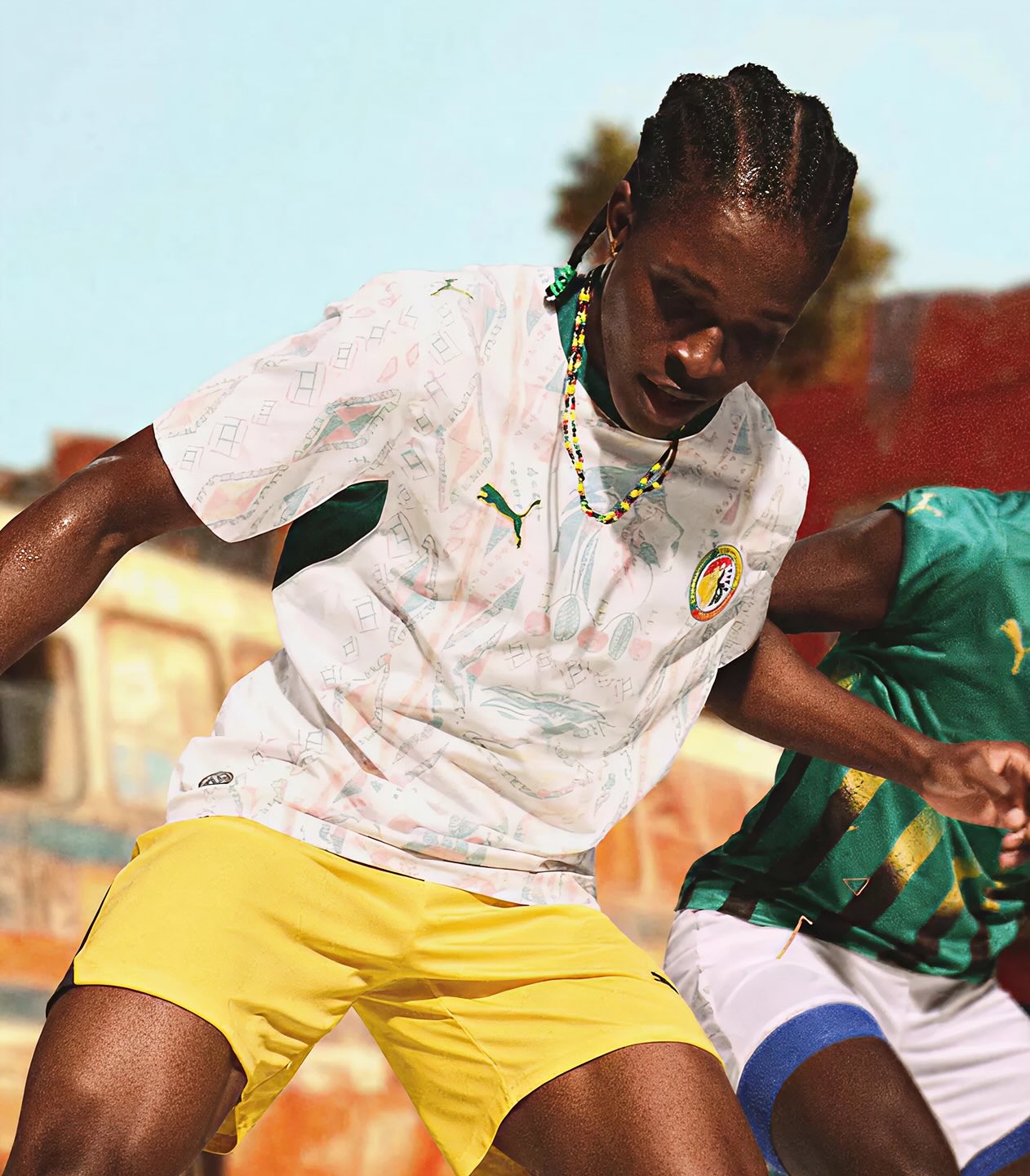
Senegal's home kit for 2026 is built around one specific, local detail. Not a generic pan-African print, not a reference to the continent as a vague idea. The Car Rapide: the iconic hand-painted minibuses that move through Dakar in a rolling exhibition of colour, folk art, and communal expression. These vehicles are not a tourist attraction. They are a functional part of the city's transportation system that became, over decades, one of its most distinctive visual languages. The drivers and painters who decorated them were not working from a design brief. They were making something beautiful out of something necessary.
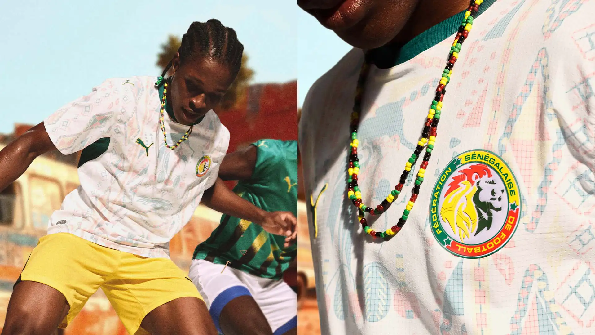
Puma's interpretation takes the energy of that tradition and layers it into the fabric of the shirt. Intricate tonal patterns inspired by traditional textiles and symbols sit on a white base. Green, yellow, and red accents tie the design to the national flag without letting the flag become the entire statement. The result is a shirt that feels like it knows where it comes from. It is specific in a way that generic cannot be.
The away kit takes a different approach but the same logic. A deep teal body textured with flowing, organic patterns that suggest movement and natural energy. Yellow and red trim. Puma's own description calls it "rhythm, pride, and energy made wearable." That language is marketing copy, and marketing copy should always be read with appropriate scepticism. But the design earns the description. The shirt moves. It feels alive. It does not look like it was assembled from a library of generic African motifs. It looks like it was made for Senegal specifically.
South Africa's kit for 2026 is the most discussed African shirt of this cycle, and the conversation it has generated is earned. The home shirt retains the unmistakable yellow and green that Bafana Bafana have worn across their history, the same palette that defined the country's 2010 World Cup appearance on home soil. But the design detail that distinguishes it is something almost invisible from a distance and entirely meaningful up close.
The graphic elements woven into the fabric pay tribute to South Africa's 12 official languages. Not as a list, not as text, but as a structural element of the shirt's visual identity. Adidas describes it as representing "the many voices that rise together in stadiums across the country and around the world." That is the kind of language that can slide into meaninglessness. But the design decision itself is precise: to embed linguistic diversity into the fabric of a national football shirt is to make an argument about what the nation actually is. South Africa is not a monolingual country with a single cultural identity sitting underneath its official brand. It is a place built from multiplicity, and the kit says that plainly.

The shirt was widely praised. One commentator called it a generational kit. Someone on social media described it as a masterpiece. The response tells you something about how hungry football fans are for shirts that say something real, shirts that reward attention rather than merely satisfying it at a glance.
Morocco's kits operate in a different register. Where Senegal leans into movement and colour, Morocco leans into precision. The away kit draws from the country's tilework and architecture: that specific geometry of Moroccan design, the interlocking patterns of zellige tiles, the arched doorways of medinas, the repetition and symmetry that make Moroccan visual culture so immediately recognisable and so deeply particular.
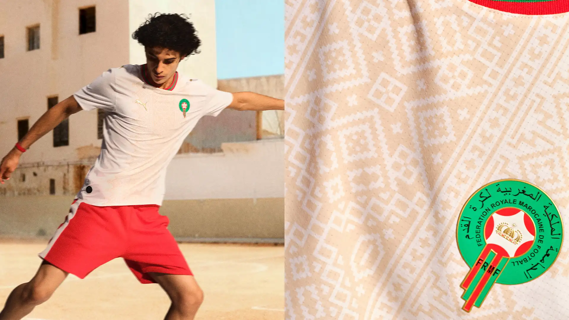
This is not a simple exercise in pattern borrowing. Moroccan geometric art is a sophisticated visual tradition with its own mathematics, its own philosophy of how space and form relate. The fact that it translates so naturally into a football shirt graphic is not an accident of aesthetics. It is a reminder that some of the richest design traditions in the world have been operating on this continent for centuries, long before they became reference points in a global brand's moodboard.
Egypt's home kit reaches further back. Angular geometric patterns referencing ancient hieroglyphics sit over a rich red base. Black and gold accents. The effect is, as the official kit description puts it, "monumental in feel, fitting for a nation with football history as deep as its cultural legacy." The shirt is self-aware about its own ambition in a way that either works or doesn't, depending on the execution. Egypt's works. The hieroglyphic reference does not feel grafted on. It feels like the shirt knows what it is trying to say and says it.

Nigeria did not qualify for the 2026 World Cup. That is a football story and a painful one. But Nike still unveiled Nigeria's 2026 kits. The shirts exist. They are available to buy. And the design conversation they have generated is, in some ways, more interesting than the kits for nations that will actually be in North America this summer.
The home shirt is clean and intentional. Nigeria Green, the specific shade that has defined Super Eagles kits for decades, applied with armor-inspired side panels that Nike describes as evoking "strength, preparedness, and competitive edge." The shirt is restrained. It does not try to do too much. It trusts the colour to carry the identity.The away shirt is a different proposition entirely. It draws from motocross graphics, and the country's broader creative culture. An all-over flame pattern moves from traditional green into Nike's Volt yellow-green. The result is polarising in the way that genuinely expressive design tends to be. Not everyone will love it. But it is doing something that the safest kits refuse to do: it is making an argument about a particular country's cultural energy, not just its national colours.
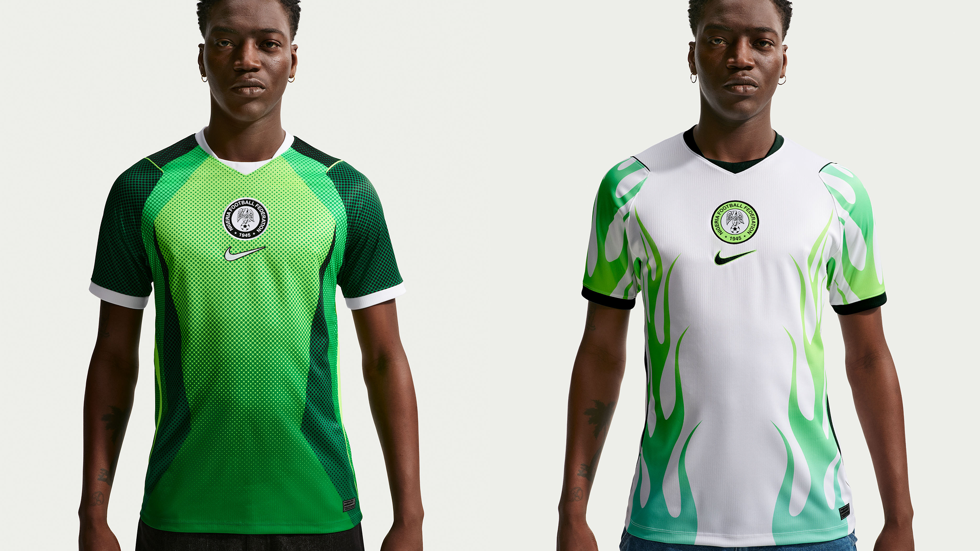
Nike's description of the away kit frames it as "a bold, youthful expression shaped by sport, music and art." That framing is telling. It locates Nigeria's identity not in its history or its landscape or its ancient symbols, but in its present, in the culture that a generation of Nigerians has built and exported to the world through music, through fashion, through creative energy that has made Lagos one of the most culturally influential cities on the planet. The shirt is not for the museum. It is for the street.
Not every African kit at 2026 earns the same attention. Some shirts in this cycle are clean and competent and say almost nothing specific. They use the national colours. They do not embarrass themselves. But they also do not make an argument. When you look at them, you do not feel the weight of a particular place or culture pressing through the fabric. They could belong to almost any team in almost any country.
That gap, between the shirts that carry genuine cultural information and the shirts that borrow the aesthetic of cultural specificity without its content, is where the design conversation becomes most useful. The difference is not about how much pattern is on a shirt, or how vibrant the colours are, or how much the brand's marketing copy celebrates the nation's rich heritage. It is about whether the design decision was specific enough to be distinctly itself. A shirt with a genuine argument in it can be executed well or poorly. The argument is the evidence of intention.
The African kits that succeed at 2026, South Africa's language-embedded fabric, Senegal's Car Rapide energy, Morocco's geometric precision, Egypt's monumental confidence, Nigeria's creative present, succeed because they were specific enough to fail. The designers made decisions that could not belong to any other country. That specificity is what makes them worth looking at.
Every four years, the World Cup produces a new visual archive of how nations want to be seen. The kits outlast the tournament. Nigeria's 1994 Adidas shirt is still one of the most recognisable football garments ever produced, still being referenced and reproduced thirty years later, not because Nigeria won the World Cup but because the shirt was extraordinary. It was green and white and black with a bold geometric pattern that looked unlike anything else on the pitch. It announced a country with visual confidence and cultural intelligence, and the world paid attention.
The 2026 cycle suggests that African nations, or at least their kit manufacturers when they are paying attention, have not forgotten that lesson. The continent has more than enough visual and cultural material to produce shirts that the world will still be talking about in thirty years. The Senegalese Car Rapide. South Africa's twelve languages. Morocco's tilework. Egypt's hieroglyphics. Nigeria's Afrobeats flame. These are not borrowed aesthetics. They are specific, located, earned.
The football is what happens during ninety minutes. The shirt is what travels further. It goes into stands and living rooms and markets and memories. It becomes the image that a generation associates with a particular country, a particular moment, a particular sense of what a place believed about itself when it stepped onto the world's biggest stage.
At 2026, the most interesting design conversation in world football is happening on the continent that has, historically, been given the least room to have it. That is not nothing. That is worth paying attention to.